Our Process: From Idea to Launch
Toby Team
November 24th, 2025
2 min read
Behind the Scenes: How We Built Colour-Coded Collections (With a Little Help From Our Users)
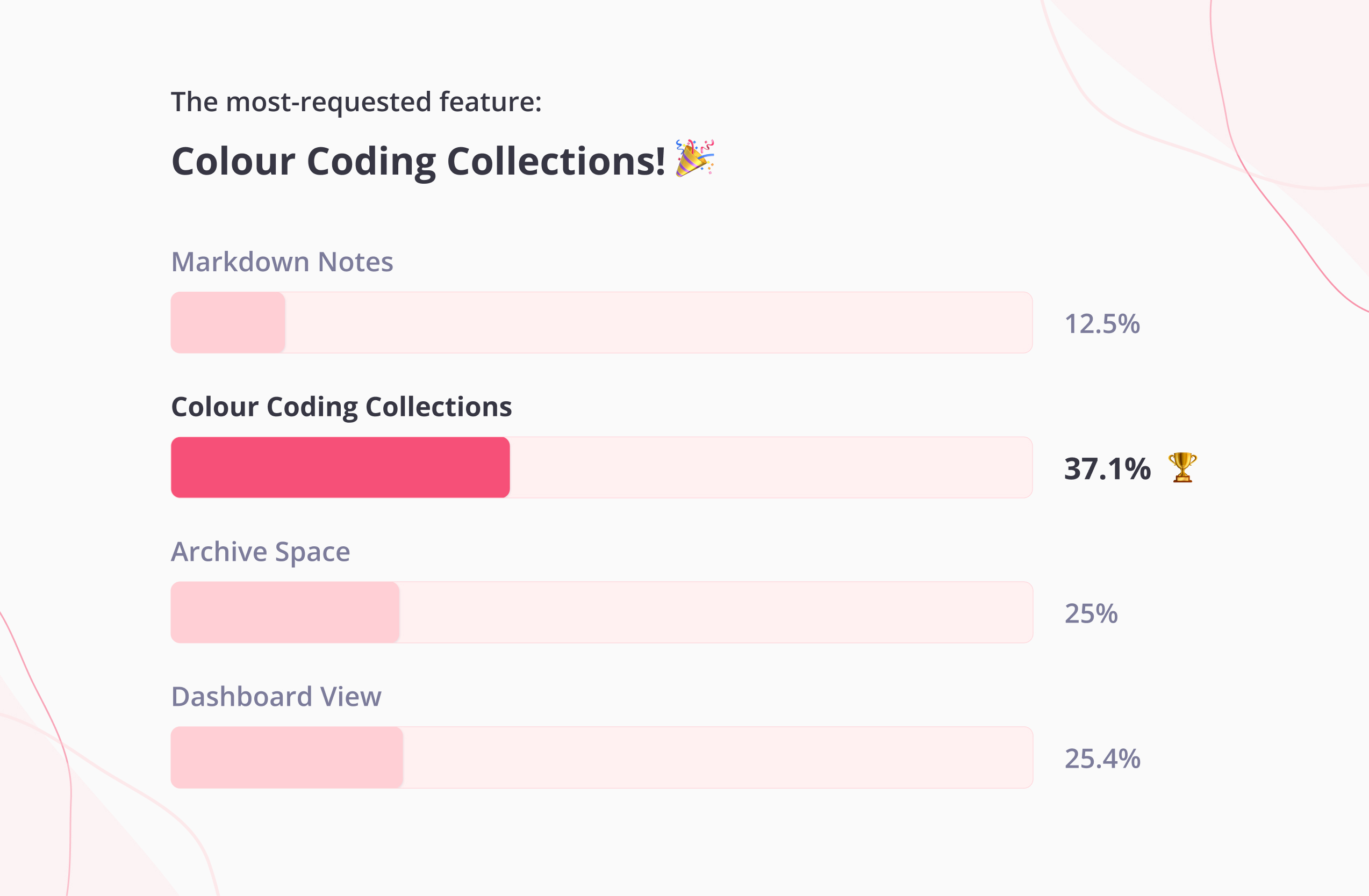
When we first floated the idea of Colour-Coded Collections, we knew it had potential. What we didn’t expect was how fun, collaborative, and user-driven the journey would become.
This feature came directly from our users. They voted for it, tested early prototypes, challenged our assumptions, and shaped what it became.
Here’s the short, behind-the-scenes story.
1. Our Users Voted, and Colour Won Big
In a feature vote with our paying users, Colour-Coded Collections became the unmistakable winner. It was clear that people wanted a more visual, intuitive way to organise their spaces. So the discovery phase began.
2. Talking to the People Who Use Toby Every Day
We interviewed the people who rely on Toby daily.
Across conversations, consistent insights emerged:
- Users wanted more flexible visual organisation.
- Colour helps users categorise, prioritise, and reduce overwhelm instantly.
- Multiple users asked for more colours, including very specific requests (shoutout to purple)
We learned quickly: people organise differently…but colour is universally intuitive.
3. Watching How Users Actually Used the Prototype
We shared an intentionally early, slightly clunky prototype and observed where users clicked.
Some found the colour option immediately. Some explored the entire interface like digital detectives 🔍.
All of it shaped our understanding of discoverability and UI expectations.
Educators instantly imagined colour-coding by subject or standard—one of our clearest validation moments.
4. Understanding What Colour Really Meant to Users
For our users, colour wasn’t just aesthetic. It represented:
- clearer categories
- faster scanning
- easier memory cues
- a calmer workspace
- a natural workflow pipeline (planning → doing → done)
5. Refining, Iterating, Polishing
Based on user feedback, we refined:
- the colour palette
- placement and affordances
- clarity of interactions
- button sizing (bigger and better!)
6. Building the Feature
From teachers organising lesson plans to power users running multiple browsers to people managing hundreds of personal resources, our users helped shape every layer of this feature.
Their feedback reinforced:
- People want visual clarity.
- People want quick mental shortcuts.
- People want simple systems that adapt to them.
- People want a workspace that feels personal.
7. Launching
Thanks to user enthusiasm and feedback, we’ve now launched Coloured Collections! Learn more about some ways you can use this feature to streamline your workflow here!
Thank You to Our Users
Whether voting, testing, sharing ideas, or clicking around prototypes—our users made this feature possible. We hope it brings clarity, delight, and a little more colour to everyone’s day.